Wanting to know how the ongoing North American Drough affects California, I was looking for a very simple chart: one showing the evolution of the storage level of the major water reservoirs as a percentage of their capacity.
The website of the California Department of Water Resources has a map showing the status of the 12 major reservoirs, but you will not find an aggregate graph.
So I made one.
I scraped the monthly storage level of 11 of the 12 major reservoirs [1], for the last 40 years in order to include data from the California Drought of 1976 and 1977. For each month, I calculated the aggregate storage level (sum of the water level of each reservoir, divided by the sum of their capacity). The result is below:
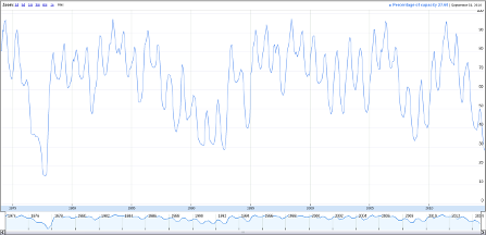
We can clearly see the yearly wet/dry seasons. As of September 2014, the reservoirs are at 27.6% capacity in aggregate. By this metric, this is the worse in 37 years since the 1976-1977 drought where their aggregate storage level dropped to 14.6% in October 1977 (California had much worse water management policies at this time - you can read a fascinating 108-page report about it).
From looking at the graph, one can guess that if the upcoming winter does not bring abundant rainfalls or snowfalls, then the drought is going to be as bad as, or worse than the 1976-77 drought by the end of the summer of 2015. This is rather scary.
[1] For some reason the Exchequer reservoir (EXC) does not have a monthly data feed —only daily/hourly and I was too lazy to adjust my scripts for this peculiarity.