A semi-popular Twitter thread by @boriquagato argues that stay-at-home orders are ineffective at reducing mortality in the US: “there is just no evidence that this incredibly expensive and harmful policy has any effect at all.”
This is, of course, preposterous. @boriquagato attempted to rank US states by cumulative deaths per capita, and observed how the ranking changed over ~4 weeks. I will explain the flaws in their application of this methodology. But beforehand, I will present a superior methodology: examining the trend of daily deaths per capita.
- Trend of daily deaths
- Trend of daily cases
- Flaws in @boriquagato’s methodology
- Summary
- Responses from @boriquagato
Trend of daily deaths
When analyzing daily deaths, be aware there is always a lag between the moment a stay-at-home order goes into effect and the moment a reduction of daily deaths is observed, for many reasons:
- delay between infection and death
- stay-at-home orders may be initially advisory or poorly enforced, and eventually made mandatory or more strictly enforced
- infected persons staying at home may infect other household members over time
- etc
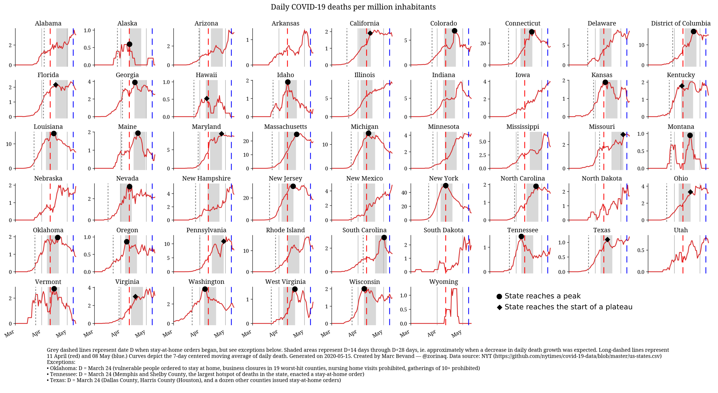
The lag is approximately 2-4 weeks. So I charted daily deaths per million inhabitants for each US state, marked the date of stay-at-home orders with a dashed line, and overlaid a shaded area 2-4 weeks later:
In 33 states—plus DC—that implemented stay-at-home orders, we expect to see and do see daily deaths either peaking or reaching a plateau at some point in the shaded area: Alaska (8 deaths,) California, Colorado, Connecticut, District of Columbia, Florida, Georgia, Hawaii (17 deaths,) Idaho, Kansas, Kentucky, Louisiana, Maine, Maryland, Massachusetts, Michigan, Missouri, Montana (16 deaths,) Nevada, New Jersey, New York, North Carolina, Ohio, Oklahoma, Oregon, Pennsylvania, South Carolina, Tennessee, Texas, Vermont (53 deaths,) Virginia, Washington, West Virginia, and Wisconsin. Some states, as noted in parentheses, have recorded very few deaths so the curve exhibits random noise in the form of peaks and valleys.
In 3 states that implemented stay-at-home orders, we see the curve is neither peaking nor reaching a plateau around the expected time. However the sources of these anomalies are easily identified, and once corrected the curve does peak or reach a plateau when expected:
- Arizona: the spike in early May is caused by a delay in reporting deaths from weeks prior Other than this artifact, Arizona has reached the plateau when expected.
- Indiana: the spike around late April is due to a reporting artifact in my data source for COVID-19 deaths. The state’s official COVID-19 dashboard shows deaths peaking on 22 April, as expected (between 08 April and 22 April):
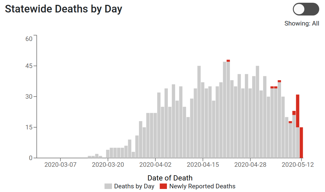
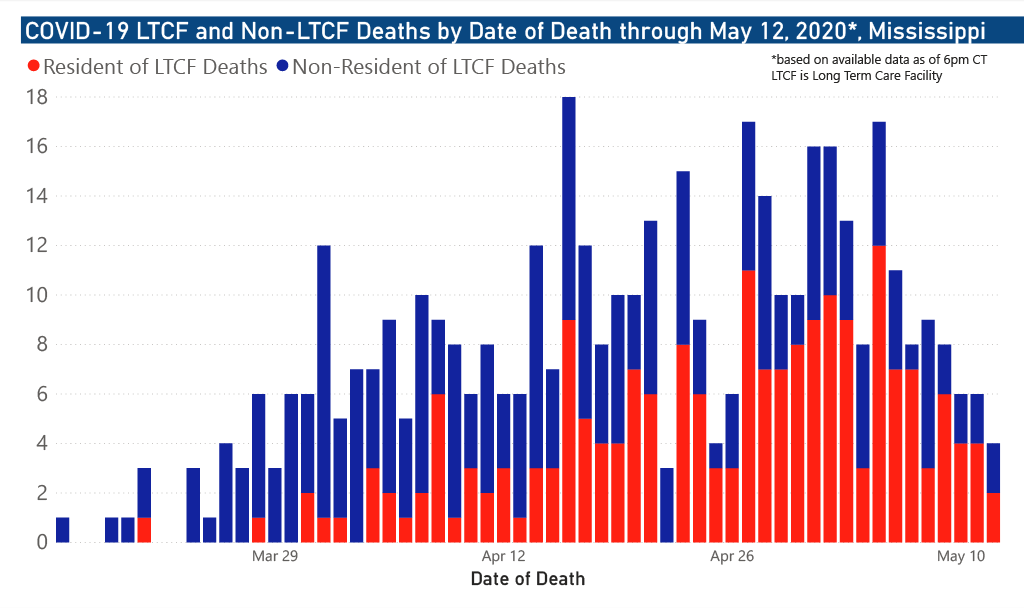
- Mississippi: the spike around early May is, again, caused by a reporting artifact. The state’s official COVID-19 dashboard shows deaths peaking on or about 27 April, as expected (between 17 April and 01 May):
In 4 states that implemented stay-at-home orders, we see anomalies with no obvious explanation:
- Alabama: daily deaths appear to continue to rise past the shaded area, however there is not enough data to tell if the trend is significant or if it will reach a plateau.
- Delaware reached a plateau around 23 April, which is 31 days after the stay-at-home order, beyond the expected delay of 2-4 weeks. The state borders Maryland who implemented a stay-at-home 7 days after Delaware did. Delaware is a geographically small state, so one possible but unverified explanation could be people commuting across the state line who continued to import new cases into Delaware for longer than expected.
- Illinois: daily death growth slows down in the shaded area, but not significantly enough to plateau. It is unclear why. Most deaths occur in the Chicago metropolitan area. Lack of enforcement in the city?
- New Mexico: a cursory search did not reveal any obvious reason why deaths are still climbing. Perhaps the state’s “grossly substandard nursing care” is to blame. 45% of COVID-19 deaths in the state occurred in long-term care facilities.
In 3 states that implemented stay-at-home orders, daily deaths continue to increase past the shaded area. However these states are the top 3 states in the nation with the highest shares of long-term care facility deaths according to Kaiser Family Foundation (Minnesota: 81%, Rhode Island: 77%, New Hampshire: 77%) well above the nationwide average of one-third. So daily death growth in these states does not reflect a failure of the stay-at-home policy, but a failure of keeping their long-term care facilities safe:
- Minnesota
- New Hampshire
- Rhode Island
In 7 states that never issued stay-at-home orders, deaths generally follow an upward trend, with no signs of stopping. However these states are so small and have so few deaths that their curves are very noisy (except the largest state, Iowa):
- Arkansas (98 deaths)
- Iowa (318 deaths)
- Nebraska (118 deaths)
- North Dakota (40 deaths)
- South Dakota (43 deaths)
- Utah (76 deaths)
- Wyoming (7 deaths: the curve is pure random noise)
Trend of daily cases
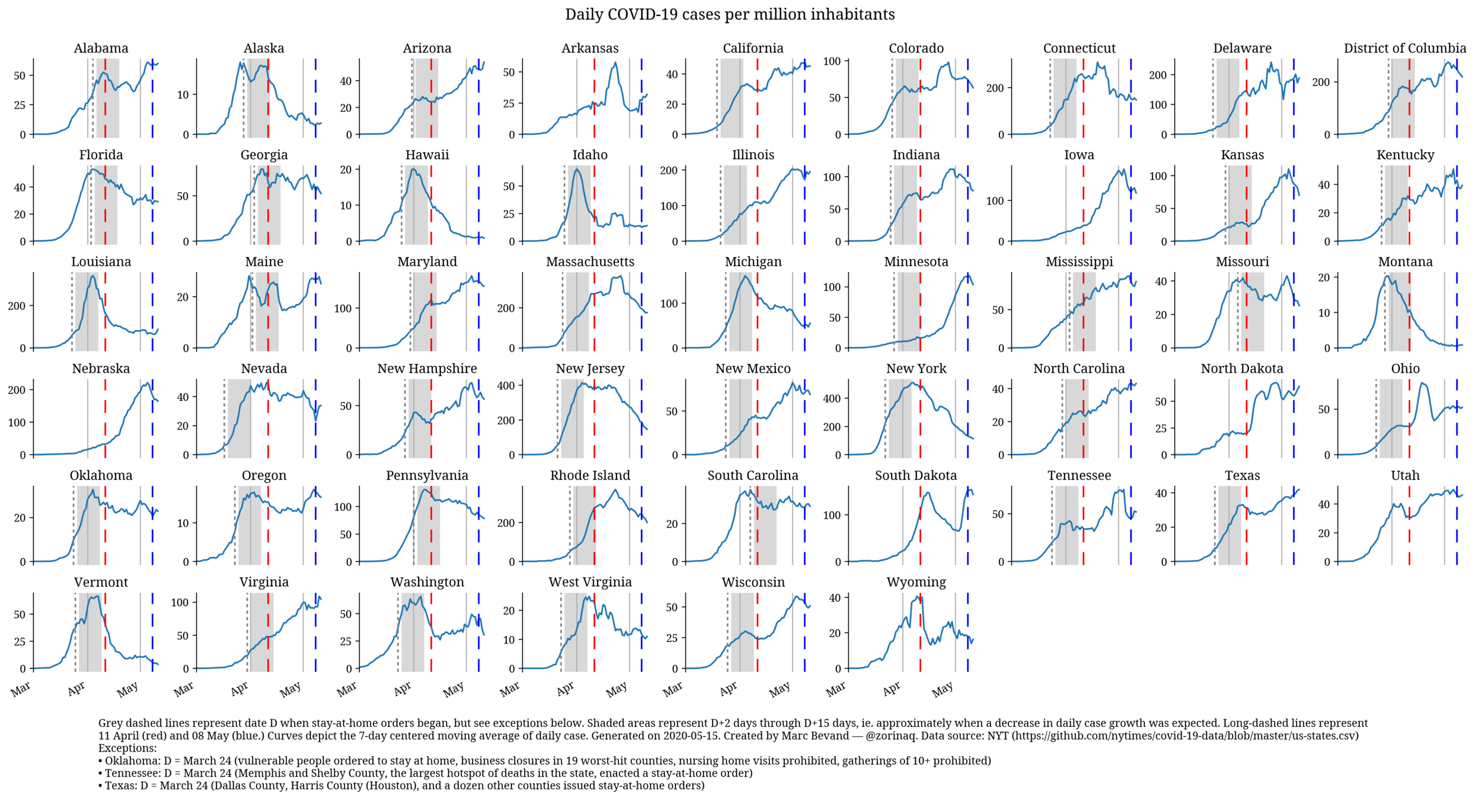
We can produce the same charts with cases instead of deaths. I expect the lag between stay-at-home orders and daily cases peaking or reaching a plateau to be 2-15 days, represented by the shaded area:
For many states, we do indeed observe daily cases peaking or reaching a plateau 2-15 days after the stay-at-home order.
However daily cases sometimes continue to increase beyond the shaded area. A likely explanation is that states are increasing the daily test rate over time, which improves the case ascertainment rate. For this reason, charts of daily deaths in the previous section are a more reliale indicator of the effectiveness of stay-at-home orders.
Flaws in @boriquagato’s methodology
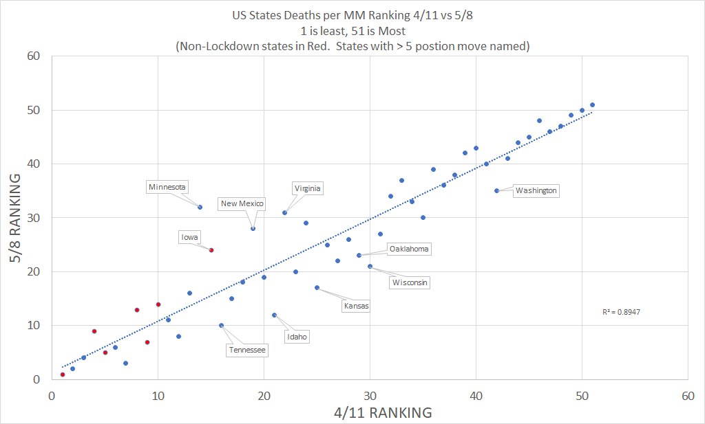
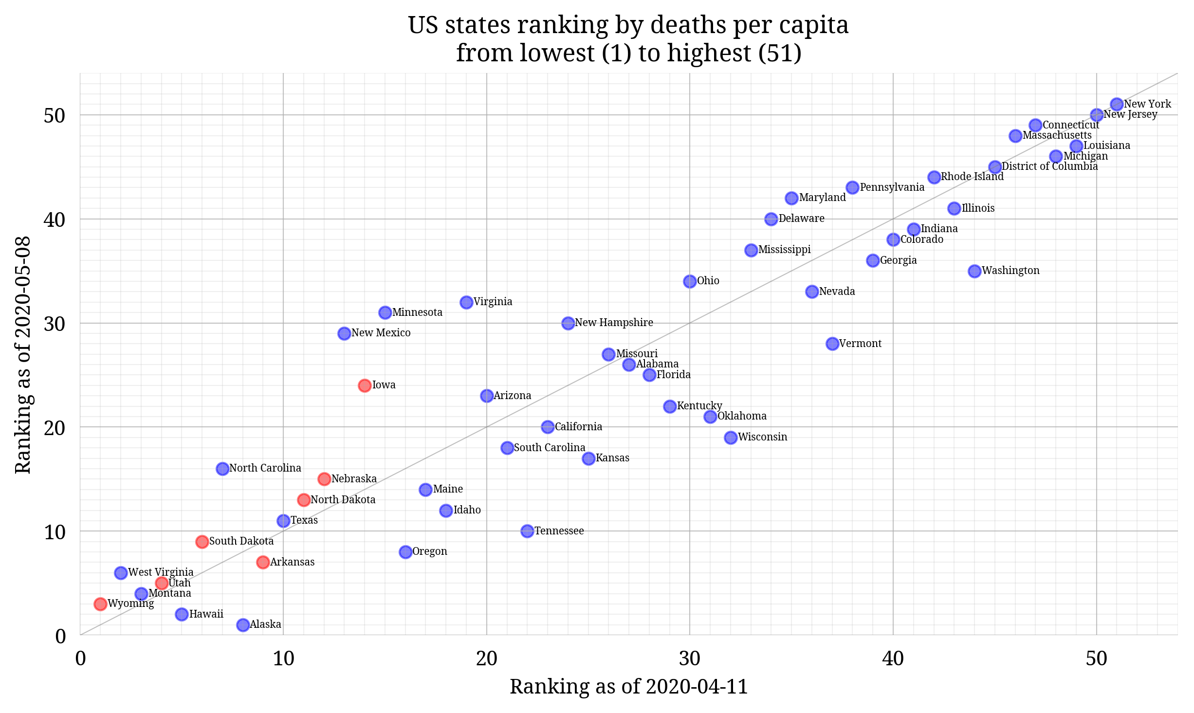
@boriquagato ranks US states by cumulative deaths per capita and observes how the ranking changes over approximately 4 weeks, between 11 April and 08 May. Blue represents states that implemented stay-at-home orders, and red those that did not:
Firstly, the scatterplot is bogus. I recreated it using
census.gov 2019 population data and
the New York Times COVID-19 data repository
and I ended
up with a significantly different scatterplot. Also, trying to place a line of best fit
on this scatterplot is pointless as it simply approximates y=x when the time span is
as short as 4 weeks. Among the states without stay-at-home orders, according to @boriquagato’s
version 4 of the 7 states saw their rank worsen, but in reality it happened to
6 of the 7 states. This is evidence stay-at-home orders are effective at
reducing mortality:
Secondly, @boriquagato selected a premature time period that failed to fully capture the effectiveness of stay-at-home orders. For example look at the District of Columbia:
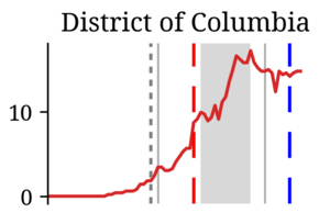
In the case of DC the stay-at-home order was clearly effective because daily death growth peaked then
started declining. However the time period 11 April (red dashes) through 08 May
(blue dashes) is too early to capture the decline in full; it should have been shifted
by minimum ~9 days. So I recreated @boriquagato’s scatterplot over 20 April–15 May
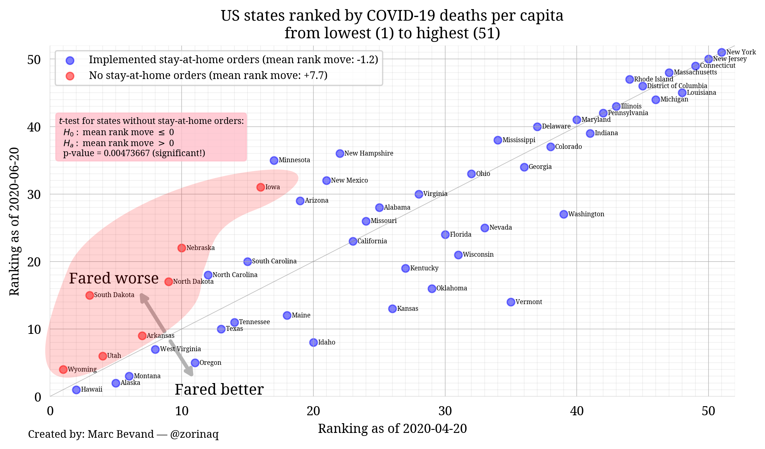
[Update 2020-06-20: I updated the chart to cover the longer time period 20 April–20 June]:
On average stay-at-home states gained 1.2 ranks, while states without the policy lost 7.7 ranks. In fact, every red states moved up above the diagonal. Can we evaluate the statistical significance of this? I assumed the null hypothesis that these states did not lose ranks, and computed a p-value of 0.0047! This is statistically significant evidence that the lack of a stay-at-home policy is strongly correlated with increased deaths.
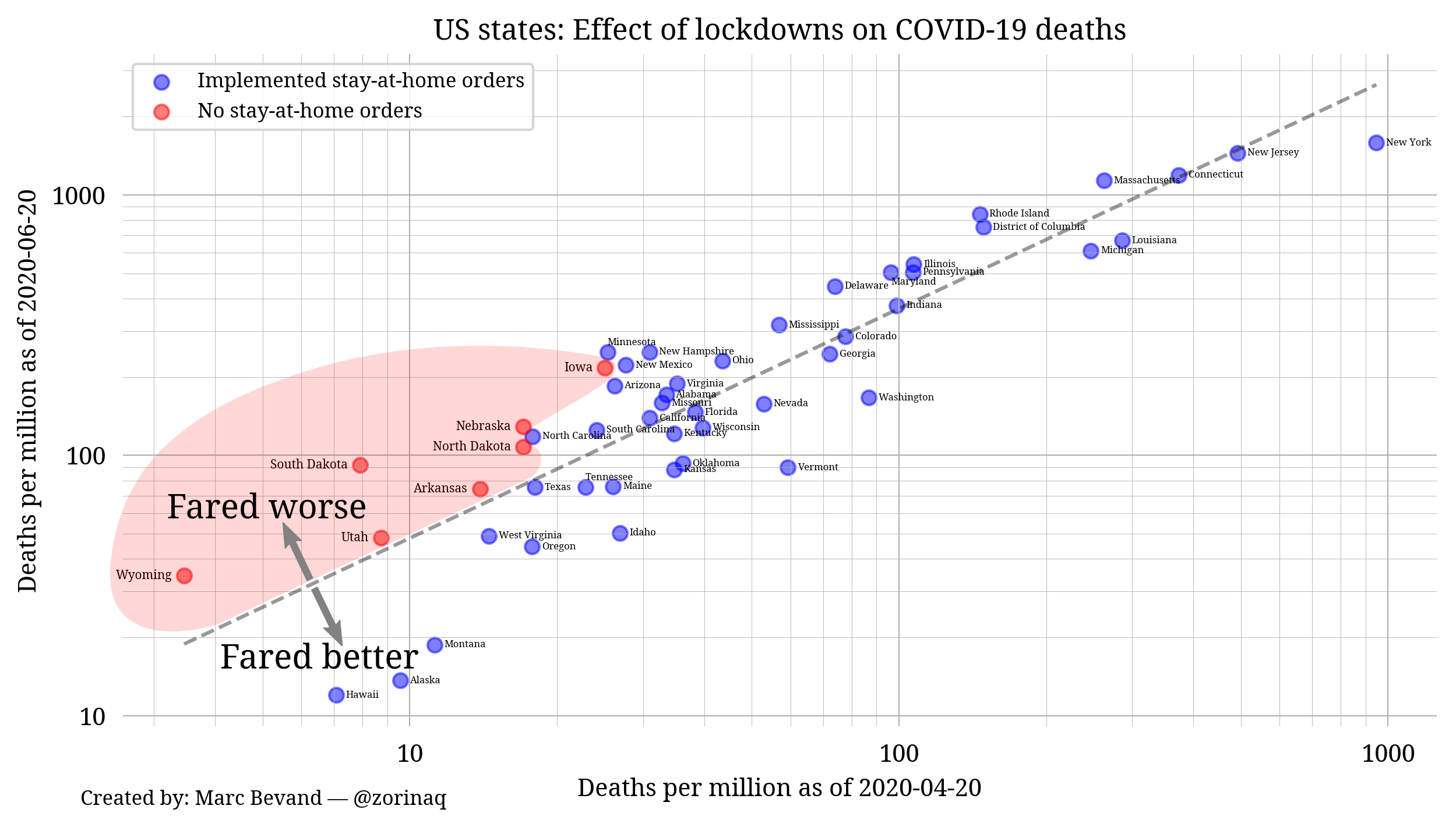
However a scatterplot of state rankings is a crude tool to validate the effectiveness of stay-at-home orders. A more refined visualization is to produce the same scatterplot but with the axes reflecting deaths/million instead of rankings:
Again, no surprises here: the states witout stay-at-home orders deviate upward from the linear regression curve (dashed line.) Deaths in states without stay-at-home orders universally increased faster than the national average.
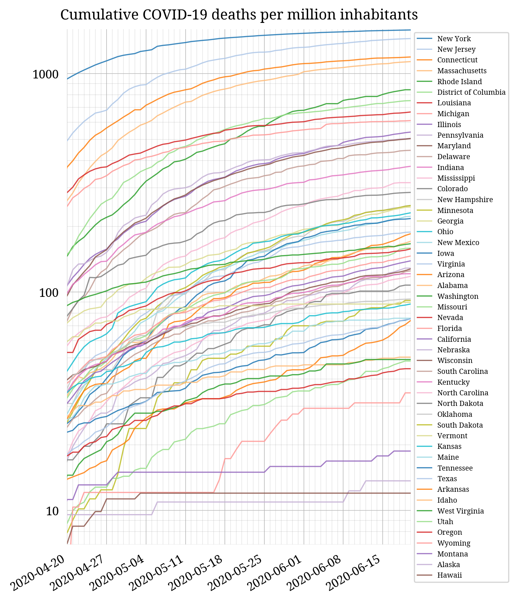
This chart is a different representation of the same data as the scatterplot above, showing deaths/capita evolving through time:
Summary
The scatterplot created by @boriquagato is incorrect, probably because of errors in their (undocumented) data sources or data input. A corrected scatterplot shows that states not implementing such orders fared noticeably worse than states that did. This is evidence that stay-at-home orders are effective.
Nonetheless, a scatterplot of states ranked by cumulative deaths per capita remains an inferior tool to validate the effectiveness of stay-at-home orders, because of the huge 100-fold difference in death rates, even before states started implementing stay-at-home orders.
A superior methodology is to look at the trend of daily deaths per capita. And indeed, among the 43 states—plus DC—that implemented stay-at-home orders, 36 states and DC (84%) demonstrate a decrease in daily death growth correlated with the timing of the order, while 4 states exhibit unexplained anomalous trends, and in 3 states unexpected daily death growth can be attributed to external factors (deaths in long-term care facilities.) Conversely, the 7 states that did not implement stay-at-home orders exhibit daily death growth that persists to this present day. This is further evidence that stay-at-home orders are effective.
This analysis could be improved if states reported deaths by date of death, like Indiana and Mississippi. Most states do not provide such data, which creates anomalies in daily death curves, as states sometimes report unreported deaths from weeks prior.
Another improvement would be possible if states provided separate statistics for deaths in long-term care facilities. Deaths in such facilities account for a significant number of total deaths, and are largely uncorrelated with whether or not a state implemented a stay-at-home order.
Finally, the findings in this post are largely supported by third-party research showing that social distancing does reduce the daily growth rate of the epidemic:
- The effect of large-scale anti-contagion policies on the COVID-19 pandemic
- Estimating the effects of non-pharmaceutical interventions on COVID-19 in Europe
- Inferring change points in the spread of COVID-19 reveals the effectiveness of interventions
- Social Distancing is Effective at Mitigating COVID-19 Transmission in the United States
- The effect of stay-at-home orders on COVID-19 cases and fatalities in the United States
- When Do Shelter-in-Place Orders Fight COVID-19 Best? Policy Heterogeneity Across States and Adoption Time
- Human Mobility Restrictions and the Spread of the Novel Coronavirus (2019-nCoV) in China
- Were Urban Cowboys Enough to Control COVID-19? Local Shelter-In-Place Orders and Coronavirus Case Growth
- Effects of Government Mandated Social Distancing Measures on Cumulative Incidence of COVID-19 in the United States and its Most Populated Cities
Responses from @boriquagato
@boriquagato made false counterclaims, did not understand my data, largely ignored my replies, and abruptly withdrew from the discussion by blocking me on Twitter:
- He finally provided the data source for his scatterplot, and as I suspected his data is bogus. He used data from 2020-04-17 instead of 2020-04-11. He never replied.
- He claimed 3 of 7 states not implementing stay-at-home orders improved their rank, but only 1 of 7 did. And again his data is bogus.
- He wrongly claimed states not implementing lockdowns changed by 1 position in the scatterplot, but in reality the mean rank move is -5 and statistically significant.
- He thought my analysis of daily deaths per capita was based on raw daily death figures, not realizing I compute a 7-day average to smooth out the spikes (the “date-of-report vs date-of-death” issue.)
- He mistakenly thought daily deaths were supposed to decline in the entirety of the shaded areas. I re-explained they either peak or reach a plateau, as expected. I marked the exact location of peaks and plateaus. He never replied.
